Posts

6 Web Design Tips to Take Your Website to the Next Level

Young woman thinking with pen while working / studying at her desk

Having a successful and continuously growing website is no easy task. You may want to consider things that might affect or hinder the growth of your website as well as how will your website stand out and shine bright like a diamond among the others in the same line. Having a clear idea on how you would want to appear or paint your brand on your target and engage them to keep returning to your web page is important to grow your brand.

Follow these tips to make your website flourish and gain more following:

  • Have a Clear Content for Your Website

    Knowing your main mission will help you set tone for your website. It is important to know what will be the content you are creating for you to keep tabs if your website is growing or if your website needs improvement.
    Studying your competition is also a good way to have new content ideas and improve what you are putting out. By continuously innovating and putting out more and new ideas, you build a stronger relationship with your audience.

  • Know Your Audience

    Having the ability to see how long people stay on your website, where they are coming from or what kind of audience you have allow you to create a better website and make the content of your website more suitable for desired your audience.

  • Have the Pages of Your Website Load Quickly

    Your pages need to load as fast as it could. You cannot make your visitors wait that long for your pages to load. When that happens, there is a big possibility that your website visitors will most likely just abandon your page and just go to another similar website.

  • Be Blunt

    Short yet clear headlines are essential. Nothing too fancy and long paragraphs should be avoided.
    Keep in mind that nothing will drive away your new visitors from your website than being bombarded with texts or words.
    All the information or texts on your wall should concise and direct to the point. Pithy and direct communication will help you attract more audience to your website. You can organize your pages using:

    • bullets or numbers
    • a lot of white space
    • short paragraphs
    • sections with subheadings
    • use images instead of text
  • Define the Path

    Upon arrival of a visitor to your website, what do you want them to do? Where do you want them to go? Having a clear path allows you to prevent your audience getting lost in the process.

  • Link to Social Media

    Social media is the perfect way and probably the fastest way to connect with your audience. It also a good way to strengthen and maintain your relationship toward them. Sign up to the top social media websites like Facebook, Instagram, Twitter, and Snapchat to reach new and younger audiences.

The most important thing you can do to grow and paint your website in a good light is to learn about your audience. Continuous discovering of ways to connect with potential audience will keep your website fresh, relevant and more useful. Use these tips to expand your website!

12 Web Design Terms Everyone Should Know

Photo of a Woman Thinking

Being in the world of web design can sometimes feel like learning a new language. You will read terms like CMS, hosting, compression, CSS. Do the terms ring a bell to you? Maybe yes, maybe no.

There are a lot of technical terms referring to the different aspects of web design and it can get confusing at times. For some who are just getting started with being a web designer or just someone looking to have their website designed, it can be really overwhelming at first.

Here’s a list of important terms that one non-web designers should know:

  • CMS


    • It means Content Management System. It is a platform that enables designers to develop and modify the content of a website without requiring one to have any technical knowledge about web codes
  • Domain

    • is simply the name of the website and it usually ends in .com, .net, .org. Domains nowadays can end with .me, .design, .io.
  • CSS

    • Cascading Style Sheet
    • Used to format the look of a website that determine how different the elements within the web page will appear on the screen by the user. It allows the different elements like color of the text, size, background, position of the different parts of the page to be set.
  • Compression

    • Optimization of file or data sizes in a format or reasonable size that takes up less space and that will eventually help to speed things up.
  • CTA

    • Call to Action
    • These are links or buttons prompting you to “Click here”, “Sign Up” that will vary depending on the website you are into is an example of a CTA. It entices or expects users to take a particular or predetermined action.
  • Hex Code

    • It is a six-digit code that starts with a #. Each hex code has its assigned color that will appear on the designer’s web page.
  • Typography

    • Refers to the arrangement and usage of different typefaces. With typography, websites are able communicate well with their visitors.
  • Hosting

    • Provides services by which data will be stored on a publicly-accessible server. Once it is uploaded, people are able to view the content of a website.
  • SEO

    • Search Engine Optimization
    • This enhances the likelihood of your website to appear or be discovered in various search engines such as Google, Yahoo, Bing, etc. Typical SEO techniques includes the use of keywords that can be helpful on the content portion and the use of metadata.
  • Visual Hierarchy

    • Web designers come up with a visual hierarchy before putting content on a website. This is important when figuring out what’s more important and what needs emphasis.
    • Helps to make sure your message gets across the right way.
  • Resolution

    • Refers to the image detail. So, when your images have a higher resolution, the higher quality it has. When a high resolution image is used in a website, it looks clear, crisp, and colorful. The image will have more details. When the opposite happens, a low resolution image will appear blurry and pixelated.

  • Responsive Web Design

    • When you say a website has a responsive web design, this means a website will fit in all screen sizes or different devices. This helps users experience optimal and seamless browsing on your website.

10 Content Ideas For Your Website

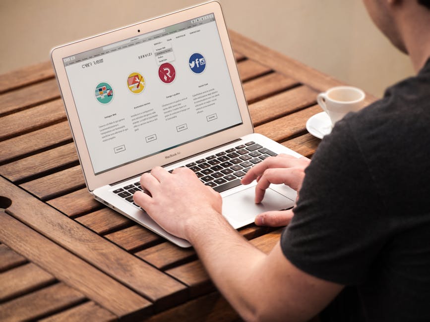
apple, computer, desk

A beautiful website might be able to attract website visitors, but what makes them stay is the content. Most companies and websites know this fact. Content is important if you want your website to stand out from the rest. Impressive content for your website will give you an obvious advantage. A good-looking website will never be enough because you need to constantly share new content to make your website trustworthy.

Here are 10 content ideas for website:

  1. Provide buying guide.

    People choose to shop online rather than going to the store. You help consumers in deciding what is best. Since you are knowledgeable, guide them in selecting a summer attire or a prom dress if you have a fashion website.

  2. Feature testimonials.

    When you feature your happy clients, more people will surely choose your website over competing brands. Make sure to constantly share how your clients or subscribers feel about your products and services. Other people will trust your site since they read your client’s stories of success.

  3. Conduct a poll or survey.

    Sharing what you know is not enough. From time to time, it’s also helpful to listen. Ask your website visitors how they feel about your website or you can also get their suggestions on how to improve your website. Converse and interact with your followers on social media. Consumers are very vocal on the internet now. You will surely get an honest answer!

  4. Highlight achievements.

    Whether you got featured on a local paper or received a recognition, let everyone know. Spread the good news and announce to your followers the recent milestone of your website. When you make a post about it, don’t forget to thank the writer of the article or the award-giving body responsible for the appreciation given to your website.

  5. Collaborate with other brands.

    It’s always you who gets to share. You can also ask fellow bloggers to write for you and share insights about what they know. If your website is all about beauty products, ask a book blogger to recommend books about fashion and makeup! This new content may attract new website followers.

  6. Create videos.

    You are not limited to just text. Color things up and upload a visual content. This allows your readers to take a break from the usual routine. A new content will keep them engaged. For example, you may want to show your go to makeup products on an ordinary day. Sharing your fashion must-haves is also a good idea!

  7. Let your online visitors meet the team.

    Give a face to team behind the website. You can introduce your team in the website’s About Us page. Assign different member to your website’s various sections.

  8. Keep yourself updated.

    Know the top trends and blog about it. Once you share it on social media, it will surely gain interactions and reach new audiences since it’s about a talked about topic.

  9. Share your inspiration.

    Share the lessons you learned from your biggest influences. Link them up and share websites that gave you inspiration. Before you it, other bloggers are also citing you and your website as their inspiration. Create a friendly community that builds each other up!

  10. Make a list.

    A huge chunk of text is boring. Make a list instead so people can easily follow what you are telling them. People will definitely go for the shorter post than a long and boring one. You can make a year ender post about the trending topics, your growths, and plans for the future of your website. On a lighter note, you can list gift ideas for Christmas or a list of your favorite summer destinations. A list might be short, but it’s definitely gonna be sweet.

11 Tips in Creating That Ideal Minimalist Website

White Smartphone Beside Silver Laptop Computer

Less is more. This is what minimalism is all about. It is like stripping away all the elements that are not needed, and only focusing on what is essential. Minimalism encourages purpose.

There are many benefits of this design approach. It has swift loading time and has compatibility between screen sizes. It also adopts to mobile browsing, but at same time, it does not harm the desktop experience.

Minimalism may seem dull and ordinary to some people, but it does require more time in its production and development stage to create one exceptional minimalist design.

How to achieve that perfect minimalist website?

  • BE CONSISTENT

    Make sure that your business logo is simple and the color palette at its minimal state. Making it flexible is good so you can use it throughout the branding smoothly and continuously. This is great in building a consistent and memorable brand.

  • FIND THE HIDDEN RELATIONSHIP

    Doing a minimalist design does not mean being less creative. If there is no compound visuals, there is a chance that you can play and explore the relationships hidden in your brand. Instead of playing with images, you can be creative with your brand name and tagline. You can try to use rhyming words so people can easily recall your brand name.

  • PLAY WITH SPATIAL RELATIONSHIP

    Consider how one element connects with the other elements to build a wider design. You can use a unique set images that when put together side by side creates a bigger picture.

  • STAY SMART

    Minimalism is not all about the lack of illustrative elements, but it is the cautious selection of where and when to use design element efficiently. Working on a distinct logo that personally relates the brand name. This can help create artistic illustrations and still have that minimal design.

  • EMBRACE EFFICIENCY

    You do not need to use all the design elements available. No deranged visuals are required to make an efficient website. Focus on how clients will reach you. Use a uniform username for all your accounts. Whether it is on your social media accounts and your website, it should have the same name.

  • BE FUNCTIONAL

    Minimalism is fantastic when it comes to functionality. Clear, clean, and uncluttered design can create easy navigation legibly.

  • FIND SOME BALANCE

    The importance of visual elements like photographs and typographical elements should be balance. No element should overpower another element without any sufficient reason.

  • WHITE SPACE IS OKAY

    White space or “negative space” can be mistaken for a blank space, but this is not true. When used wisely, white can balance your design, declutter it, and it helps your page breathe. Ultimately, it will make your website look classy.

  • BE DIRECT

    When there’s just too much elements in one page, a website visitor will not know where to look. Be more direct by giving right away important details at the topmost portion of the website. When there’s a sitewide sale, put it on the main page.

  • MAKE YOUR TYPE VISUAL

    In minimalism, your preferred font type is a vital weapon. It can act as a visual element when you adjust it. For example, you create a ripple effect on the text. Instead of adding more images, you can opt to play with different font types.

  • THINK OUT OF THE BOX

    Minimalism can also afford to be playful. You can experiment on the position and composition of elements. Instead of the typcial horizontal or vertical alignment, you arrange images diagonally. A little eccentricity won’t do no harm as long as the legibility of your text is not affected.

The lesser elements your design have, the lesser chance for the website to go out of style. Web designs that follow the concept of minimalism require fewer upgrades and can be considered timeless.

© 2017. All rights reserved. Phoenix Website Design • Sitemap • (602) 388-8622
20 E Thomas Rd #2200, Phoenix, AZ 85012
Phoenix Web Design

Serving: 

Apache Junction, Avondale, Buckeye, Carefree, Chandler, Chandler Heights, El Mirage, Fountain Hills, Gilbert, Glendale, Goodyear, Litchfield Park, Mesa, New River, Paradise Valley, Peoria, Phoenix, Queen Creek, Scottsdale, Sun City, Sun City Grand, Sun City West, Surprise, Tempe, Tolleson, Wickenburg