Posts

Phoenix Web Design – What Makes a Product Page Effective?

A product page is an important part of your website.  These pages should be enticing enough to encourage engagements, and eventually, lead to sales and revenue. A good product page should be able to catch the customer’s attention and motivate him to add the products to his shopping cart. Most websites allocate their resources to make their product pages more interesting, engaging, and convincing.

Browsing the web on a macbook

Browsing the web on a macbook

In this blog post, I will create a short list for you. I will also create a follow-up post regarding the specific page elements. For now, let’s discuss the basics first on what makes a product page compelling.

A good product page should have…

  • A sharp, high resolution photo: A product page’s most important aspect is its photo. In the world of online shopping, a customer wouldn’t buy a product if he is doesn’t know what he is buying. An unintelligible photo is big NO for product pages.
  • A bulleted list: Customers don’t have time to read long product descriptions. They prefer to skim words in bullets (like this list!) If you have a succinct list of product details, it is easier for your customers to find a product that he wants. For online bookstores, the dimensions, publication date, publisher, imprint, and ISBN are usually present in a list format.
  • A general overview: Of course, not everything is in bullets. You also have to provide a short description regarding the product. For example, if you are selling a book, you need to add the synopsis. By reading the provided synopsis, the customer can decide if a book appeals to them or not.
  • Other features of a product page include: call to action button like buy now, shop now, or add to cart. You also need to add social proof or reviews from other customers.

Basically, these elements constitute a great product page. Your product descriptions are an important part of the page. Let’s continue to use the book example. The synopsis and genre will help grab attention of your customers.

Don’t just focus on the product. Allocate time and effort to formulate creative descriptions.  Keep in mind who your customers are and personalize a product description that appeals to them. Also, write about the features of the product, and highlight the benefits of it, too! You mix and match until it suits your target audience.

Learn from Amazon.

Let’s take a look at Amazon’s product page and learn how they are designing their product page. They topped the list of the biggest e-commerce retailers in 2017. So, it’s only natural to learn from the best among rest. Apple, Wal-Mart, and Macy’s were the runners up.

  • If you look at Amazon’s best sellers in the point-and-shoot digital cameras section, the number 1 camera is a Sony DSCW800/B 20.1 MP Digital Camera. The product page includes a specific title, 7 product photos, 1280+ reviews, a list of product features, many more.
  • The title of the product listing was very specific. It includes the model number and the megapixels of the camera. The customers can easily search the web for other details regarding the camera. Then, there are several photos provided, and it even automatically zooms in the moment you hover on a photo. Plus, there are bullet points that highlight the specific features of the digital camera.

Phoenix Web Design – 5 More Words That Will Help You Gain Your Customers’ Trust

German words on paper.

German words on paper.

If you’ve read the previous post, you’ve already read the 6 words that will help you gain the trust of your web visitors. This time around, I will give you 5 more words. Are you ready? Read all about them below:

  • Imagine.
  • When you ask your customers to conjure a mental image, they use their imagination. In these stories, they are the main protagonist. Thus, “imagine” will help you in letting your customers think they need a product or service in their life.
  • They will imagine themselves in a better state using your products. As a salesperson, when they have imagined something, you just need to give them one last nudge, and definitely, they will click that “buy now” right away.
  • Senses.
  • You don’t need to use the word “senses,” but you need to use verbs on sensory experience.
  • Some examples include: see, watch, sound, hear, and many more.
    • For instance, you say something like…
    • Want to see how our state-of-the-art product works? Watch a live a demo here.
    • The words “see” and “watch” awakens people’s senses. You will be able to immediately get their attention.
    • So, use sensory language as a way to tap on people’s auditory and visual sensation.
  • Name.
  • Calling your customers by their name will make them feel special. When someone calls you by your name, they have your attention. You immediately stop what you are doing, and check who called you.
  • Same is true for email messages. You wouldn’t read a generic sales email. However, if you see your name on the subject line, you will stop and read what it’s about. Don’t hesitate to call your customers by their given name because they will pay attention better with whatever product or service you are offering them.
  • Power Words.
  • The English language is brimming with a plethora of words that evoke strong feelings of encouragement, fear, joy, and safety. Know how to use these “big” words at the perfect moment. Here a few power words you can add to your page titles, blog posts, and banners:
    • Phenomenal
    • Terrific
    • Breathtaking
    • Awesome
    • Best-selling
    • Authentic
    • World-class
    • Thorough
    • Secure
    • Unbeatable
  • Because.
  • Ellen Langer, a professor of psychology at Harvard, shared her research study regarding the word “because.”
  • She asked a group of people if it would be okay for them when somebody decides to cut a long line. Here are the sentences she used when she requested to break in line:
    1. Excuse me, I have 5 pages. May I use the xerox machine?
    2. Excuse me, I have 5 pages. May I use the xerox machine, because I have to make copies?
    3. Excuse me, I have 5 pages. May I use the xerox machine, because I’m in a rush?
  • The results concluded that how you write/say your request really affects how people would respond. When she did not give a reason, only 60% people agreed. However, when she stated that a specific reason (see sentence 2 & 3), more than 90% of the people allowed her to cut the line.
  • What’s the moral of the story? You should always include a reason behind your action.
  • So, don’t ask your customers to fill out a survey without explaining why you want such information. Tell them the purpose of their given input.


Phoenix Web Design – Words That Can Help You Gain Your Customers’ Trust

Without words, you won’t be able to your audience to check out your website. Words are your weapon. These words will help you convince web visitors to convert into customers. So, your word choices are important in writing product descriptions, creating blog posts, and composing marketing emails. Below are the 6 important words that will help you gain people’s trust.

  • You

  • Write in the second person POV. Always assume that you are directly talking to them. One way of doing that is using the word, you.
    • For example, The shirt suits you because it is comfortable and is built for everyday use.
  • For the most part, you are selling to your customers. Talk more about the benefits of your products, and not about your company. Every time you see yourself from talking from your perspective, always go back and try to find a way to rephrase it to the viewpoint of your customers.
  • Do

  • Instead of using the word “try”, go for “do.”  For instance, “try to change the settings by…” say, “to change the settings, do this and do that…” This makes you more skilled and authoritative. Thus, your readers will have confidence following your instructions.
  • And

  • When you use the word “but,” it implies a negative connotation. The word “and” is a solution for you when you are dealing with unfavorable comments or contradictions.
  • The word “but” signals that you are about to say an antagonistic statement. “And” is an all-embracing word that makes you seem to agree even though you are at odds.
    • Take a look at these 2 examples:
    • “We stayed at home, but we just watched The Wizard of Oz.”
    • “We stayed at home, and we watched The Wizard of Oz.”
    • The second sentence seems like they enjoyed the 1939 movie, while the first sentence says otherwise. It’s as if they weren’t excited that they were watching a classic movie. Word choices really make a difference.
Assorted Quotes Hanged on Wall

The words that motivate you.

  • Or

  • Don’t ask your customers if they would like to buy your product. Instead, give them a wide array of choices. If you only present one single option, their only choice is either to accept or to reject. However, if you provide them multiple options, you have increased your chances of receiving a yes from your customers.
  • So, don’t just tell them to check out your products. Instead, tell them that you offer it in different colors and size. Would they like it in red, blue, or yellow?
  • Should we … ?

  • Ask your readers. You don’t have to constantly tell them that “you should check this” or “you should do that.” It seems that it’s very bossy and pompous of you. Rephrasing propositions as interrogative questions encourages the customers to be open-minded. It extinguishes the idea for the conversation to go awry.
  • Support

  • According to Matthew Dixon and Brent Adamson’s The Challenger Sale, sales representatives should express agreement and work as one to show “support” or “unity.” This could have an influence on your buyer’s mindset. It enhances your customers’ purchase experience because they are sure that there’s an entire team ready to help whenever they encounter trouble. It strengthens customer relationship and brand loyalty.

Phoenix Web Design – More Tips on Writing Product Descriptions

In the previous post, we have defined what classifies as “good” product descriptions. This time, I will discuss further the said topic by giving you 4 more tips on how to write product descriptions that actually sell. Read all about them below:

  • The tone is dependent on your brand.

  • A good product description should sound like you. Is your brand more relaxed, chatty, and informal? Is it rather elegant, smart, and sophisticated?
    • If you are selling casual wear to the millenials, there’s no need to sound like you are selling Gucci. Casual wear focuses on personal comfort more than formality. Try to use words that are suitable for everyday use. Find words that are homey, laid-back, and simple.
    • Describe the feeling of the dress rather than discussing the materials. Wearing this textured sweater will make you feel cozy. Your text and your brand go hand in hand.
    • However, if you are selling high-end dresses, words will be more refined. It would be described as “chic,” “exclusive,” “intricate,” and “unprecedented.” Of course, when is it’s a $1,000 dress, expectations are high.
  • Whatever you choose, make sure to be meaningful to your brand. Word choices should be connected and coherent.
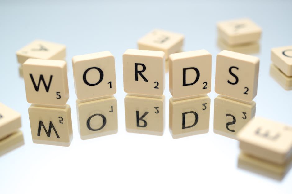
Words Text

The power of words.

  • Make your descriptions easy to scan.

  • Scannability is important because people won’t read the entire description. They love to skim and just proceed to the important points.
  • If you are not direct to point, they will find another retailer that will be providing a concise product description. People won’t have time to every little detail. So, provide a short summary and highlight the most important ones.
  • If there are other essential details, use bullets to provide a clear description. The bullets will break the huge chunks of texts, and provide a remedy for monotonous sentences.
  • So, when you are unsure what to write, use bullets. Talk about the product’s unique features and benefits rather than blabbering about the technical specifications.
  • Add influential words to the mix.

  • After using bullets, it’s time to add words that will definitely boost your products.
  • Here are some of the most influential words, via David Ogilvy:
    • Amazing
    • Sensational
    • Remarkable
    • Revolutionary
    • Miracle
    • Magic
    • Quick
    • Easy
  • For those who do not know, David Ogilvy is a known advertising tycoon, dubbed as the “Father of Advertising”. He is founder of Ogilvy, a creative network.
  • Adding any of these words your product descriptions transform from being simple to special. Words help change people’s minds.
  • Don’t for forget to optimize for search engines.

  • Words are not just helpful in descriptions, but also for SEO.
  • Placing keywords in product descriptions and product titles help boost your rank.
    • According to Shopify, you should include keywords in four places the SEO for your website:
    • page titles
    • meta descriptions
    • product descriptions
    • alt texts
  • Your meta descriptions should also be the same with the product descriptions. However, if you think product descriptions should be improved, try adding creative words. Generally, adding specific keywords to the page title and product descriptions help in terms of search engine optimization.

At the end of the day, if it works for you, don’t change it. In most cases,  an effective product description is something that is short and straight-forward. If your website offers a short and sweet product description, it’s all good.

Phoenix Web Design – Writing Effective Product Description

Aside from product photos, another factor that encourages customers to purchase an item is the product description. People do tend rely on words when shopping online. One study shows that 20% of transactions do not push through because of insufficient product information.

Good vs. Bad Product Descriptions

Because it’s lengthy, the description is automatically “good.” NOPE, the length has nothing to do how good a product description is.

A good product description is able clearly tell you.

  • what its use to your life
  • why you should buy it

When you’re selling shirts online, it’s pretty easy to write descriptions because everyone uses it. However, if you are selling something unique, that’s when you need to explain further. This is where you need to be detailed in creating your product descriptions to eliminate any confusion.

On your website, product descriptions should:

  • plainly and openly define the use of the product.
  • highlight the benefits.
  • add other important information like technical specs for mobile devices.

The product description should be able to tell the customers what they need to know.  A bad product description is the total opposite of clear. If a customer still has questions about a product, then, the description failed miserably.

Description Scramble

Tips on writing effective product descriptions.

To prevent that, I’ve listed helpful tips for you in order to create effective product descriptions.

  • Think of your potential buyers first.
    • You just don’t go on and write flowery descriptions to entice people. Consider these points before you draft your product descriptions:
    • Age, Gender, Location
    • Education and Income standing
    • Language(s) spoken
  • This will be your guide on what to write because you have identified your target audience. If you don’t know who your buyers are, you would know how to write the product description, and what to include (or not include) on your list.
  • Let’s take a look at Apple’s iPad. Everybody knows what it is so the product description focuses on the tech specs of the product. It presents you the differences on size and weight, buttons and connectors, built-in cameras, apps, sensors, chip, battery, and compatible accessories.
  • However, if you are selling a beauty product, the appropriate product description is quite different from the iPad. This time around, you need to add what is in the beauty kit, how to use the product, and the benefits to your skin.
  • Include the benefits and special features
  • Motivate your customers by highlighting the product benefits because they will always ask, “What’s in it for me?”
  • Point out that your product addresses a concern. So, if you are selling shirts online, anticipate what your customers will be asking about. Most probably, it’s the color options, available sizes, feel, and level of comfort.
  • Give them a reason to buy your shirts, and one way to do that is by adding a list of specific benefits & extraordinary features.
  • Here are some notes for you:
    • A long list will just bore your customers so pick your top 3 important benefits.
    • Elaborate the advantages of buying your product.
    • Explain how it provides a solution to your customers’ existing problem.
    • Think of your buyers when listing the benefits. If you know they’re buying a product because it’s cheap, then, highlight that you are selling the cheapest product in the market.

Psychological Tricks You Can Use On Your Website (Part 3)

So, we have reached the last part of the different psychological tricks you can apply on your online business. If you want to review on the previous two blog posts, you can click here to go to the 1st part, or visit this link to read the 2nd part.

These concepts are not my own and this is inspired by the book, Influence: The Psychology of Persuasion. Without further adieu,  below are the last 3 psychological tricks you can apply on your website to generate more traffic and gain more customers:

  • Price

  • Nowadays, it’s tough to convince potential buyers. They don’t purchase an item just because it’s the cheapest.  Now, customers after their money’s worth. They look for the best deal available online before deciding where to buy.
  • The classic example of using the “$19.99” tag is a very effective pricing strategy.  This tactic convinces buyers that an item is only $19 even though it’s practically $20. It manipulates customers that they are saving a lot, but the truth is that there’s not much price difference to be honest.
Price tag barcode

reading the price tag.

  • Right Timing

  • Amazon is able to perfect this strategy. For example, when you add a book to your cart, Amazon gives you other book recommendations. Once you are ready to check out, it will inform you that customers who purchased the book also bought these items.
  • Similarly, if you are selling action cameras, why not offer a extended warranty plan when they reviewing their cart. Perhaps, you can also offer camera accessories or micro SD cards for video storage.
  • Do not offer these extras if they are still pondering on what digital camera to buy. Some cameras are compact while some have waterproof features. It’s totally unnecessary to overwhelm customers with accessories at this point.
  • Once they have purchased an item, you can send a “thank you” email and include a list of compatible accessories for their chosen device.
  • Colors

  • Online shopping is mastering the art of persuasion and one way to persuade people is through the psychology of colors. Just by the appearance or color of your website’s CTA buttons, it could help you increase conversion rates. Thus, it could lead to more sales.
  • Color remains to be the strongest visual hint for online shoppers. In a one survey, 93% of consumers considered to buy an item because of its appearance alone. The remaining 7% is because of the item’s texture and smell.
  • Additionally, 85% of consumers admitted that they purchased a product because of its color. It’s no doubt that color influences brand recognition. Other factors aside from color, include: design, convenience, and the power of words.
  • To give you a more concrete example, the color red and orange can uplift your website and give a hint of electrifying and energetic vibe. Blue is a good color for weight loss. So, if you are selling food, avoid the color blue. Did you notice that the leading fast-food chains are never use blue? They’re usually red, orange, or yellow.
  • Blue, however, calms the mind and encourages trust. So, it’s ideal for services like banks, high tech products, and more. If you want to know more about colors, you can learn more about it here. If you need color scheme tools, this post will help you. Lastly, if you need tips in choosing the right color scheme, this article is for you!

There you have it! That wraps up the blog posts about the different psychological tricks. So, what have we learned? Understanding your customers is crucial in creating a persuasive website and compelling UX experience. Apply these tips when designing a new web page or when you are devising a new marketing plan.

How to Prepare Your Retail Site for the Christmas Holidays

It’s hard to believe that 2018 is almost over. The holiday rush is among us and we are going big on gifts, parties, and more. For online retailers,  it’s the perfect time to redesign websites with holiday-themed banners. Holiday specials and promotions are everywhere and every business out there is doing the same plan of action. In order to get your business noticed, here are 3 tips for websites this joyous holiday season.

Assorted Christmas Tags

Are your websites ready for Christmas shopping?

  • Tip #1: Start Planning Early.

    • October is the ideal time to start the drafting the holiday game plan. Whatever your business may be, it’s important to prepare early. Holiday campaigns need time to disseminate. Even with the help of the internet, sharing pertinent information takes time. Aside from that, people need time to earn enough money, share the news on social media, and tell their friends.
    • Plus, if you don’t start early, other businesses have already started with their own promotions, and sitewide sales. You’ll be left with only a few potential customers. It’s important to reach out to your target customers before the other websites do.
    • Online retailers should notify about their sales a week or two in advance. They should start spreading information about it in the different social media platforms. Big events such as Thanksgiving, Black Friday, and Christmas should begin marketing 3 to 4 weeks earlier. You can’t expect tons of customers to visit your online store if you just promoted your sale a few days before.
  • Tip #2: Use Custom Images to Advertise Sales.

    • Since it’s the holidays, incorporate Christmas trees, reindeers, and snowflakes to your marketing ads. Text promotions look bland without adding relevant images. Each time you have a special sale make it a point to add timely and vivid photos with your ad.
    • There should be a certain template that you should follow. The individual ads, the holiday website banner, and the social media photos should be uniform. All the marketing materials should contain a watermark of your logo, links to your official social media accounts, and of course, the website.
    • Some  businesses even add a unique hashtag to add a personal touch to the current promotion. So, people online can easily identify the products and services that are currently on sale.
  • Tip #3: Spread the Word Through Giveaways.

    • It’s the holidays so naturally, people are going to purchase and hoard different items. Sometimes, you don’t need to stress about marketing and convincing others to visit your site. You let your customers do the marketing for you. By doing giveaways on social media, people can just easily share your current promotions.
    • Whether your audience is on Twitter, Instagram, or Facebook, you are can do a “like and share” giveaway.  Anyone interested can just repost your status update on your social media accounts. You might be giving out a handful of freebies to lucky participants, but then, the ripple effect of your social media promotion remains unparalleled.
    • Another piece of advice: it does not have to be a social media giveaway at all times. You can just even offer FREE gift to any customers who spend a minimum amount on your website. Remember that during these times, every business is thinking of a unique marketing strategy.  If everyone is doing a 10% off, why not make yours 15%? When every business is offering the same promotion, it’s not much of sale anymore.

Why Free Shipping Matters and How You Can Offer It On Your Website

It’s NO secret that a FREE SHIPPING offer helps greatly in converting website viewers to customers. According to Comscore’s webinar on February 11, 2010, the resource speaker Gian Fulgoni mentioned that 75% of the online shoppers asked answered that they would switch to another online retailer if shipping was not free during the checkout process.

In a 2008 survey conducted by Forrester Research, online retailers noticed that their web department became larger by 18%. However, 40% of the customers surveyed expressed that they were shocked at the shipping costs. Thus, carts were abandoned upon checkout. Sadly, many orders did not push through.

Two Brown Boxes

The Many Ways to Offer FREE Shipping

The Free Shipping Tactic

In order to generate more sales, several online retailers decided to add FREE SHIPPING as one of their selling strategies. Rather than shopping at Amazon, where shipping rates are calculated per item, customers now prefer websites like Wordery and Book Depository. These businesses make use of the “free worldwide shipping” marketing. How can people say NO to that?

The trend continues to increase and many businesses follow the same suite. There are a variety of ways to offer the FREE SHIPPING strategy:

  • Free Shipping Will Be Available Once You Reach the Minimum.

    • Amazon may not offer free worldwide shipping. However, they utilize this shipping strategy. They only provide free shipping for orders above a certain amount. When you order over $25, you are entitled to a free shipping option upon checkout. The package will be delivered to any U.S. state within 5-8 business days.
  • Flat-Rate Shipping Strategy.

    • Another popular marketing strategy is the flat-rate shipping. This option is cheaper than weight-based shipping especially if the items are quite heavy. The United States Postal Service offers a Priority Mail program to any U.S. destination. With its flat-rate shipping option, the shipping cost is uniform for all packages as long as it is not beyond the 70 lbs. maximum weight.
  • Free Shipping Only Applies to Selected Products.

    • Offering free shipping when you are selling a bundle is ideal. It encourages customers to try out the product bundle. Instead of just buying a piece, you are enticing them to get a bundle + FREE SHIPPING. For example, you can offer a jewelry set that includes a necklace, a pair of earrings, and a bracelet. Group products that complement each other and offer them as a bundle to take advantage of the FREE SHIPPING offer.
  • Limited-Time Offers During the Holidays.

    • Limited-time offers are effective marketing tools in order to cross-sell other items. It’s a terrific way to subtly tell customers to check out other products. Amazon is great at putting together related items. They will show you their “customers who bought this item also bought” list. So, you will end up adding more items to your cart in order to stock up for the holidays.
    • This is also an effective strategy to sell the remainder stocks in your inventory. It’s the perfect move to remind people that this is their last chance to buy multiple quantities. For example, you can offer a buy 5, get 1 promotion.

In conclusion, there are many faces to the FREE SHIPPING marketing strategy. These are only some of the popular options. If you want to know more on Amazon marketing strategies, I’ve posted about it here. In designing a website, it’s also important to take note of these consumer behaviors. You need to study how marketing strategies like FREE SHIPPING affect eCommerce and how it can help your improve your online store.

3 Web Design Tips from Amazon (Part 3)

This will be last of the 3-part series. For the first part, we’ve discussed Amazon’s color choices, their ability to create a huge demand for their products, and being able to group related products together. For the second part, there’s Amazon’s rating system and their free shipping deal for orders over $25. Now, here’s the last 3 tips you can learn from Amazon.

  • Tip #1: Build an exclusive club.

    • The rating system is effective in creating trust. Customers from all over the world converge and give out their honest opinions on the different products. These established relationships lead to more engagements.
    • These people won’t mind spending a few extra bucks for a special subscription like the Amazon Prime program. With $12.99 a month, customers have an exclusive FREE Two-Day shipping and FREE Same-Day Delivery. Plus, they have unlimited access to songs, books, and photo storage.
    • The customers are in it for the exclusive promos and discounts. It is Amazon’s way of strengthening customer ties and proving to the world they can do more.
    • So, how can you do this? You have to listen to customers and what they want. Offer solutions to their problems. Find out how you can help them. Your answer does not always have to be a product. It can also be through publishing high quality content.
Five People Shopping

A group of frequent shoppers.

  • Tip #2: Consistency is key.

    • If I were to describe the world’s top brands in one word, it would be: consistent. These brands don’t just focus on the months ahead. They aim for the future.
    • A brand is more than its logo. You are your brand. You are the best representation of it. You have to  consistent in showcasing what you want. If you are fickle, you won’t be able to establish trust among your customers. From time to time, you change your message. It confuses everyone and derails you achieving something concrete.
    • In order to convince people and eventually boosts sales, you first need to be sure on what you want, your aspirations, and your goals. Look at Amazon… they have been consistently offering free 5-day shipping if your total is more than $25. Amazon Prime members can take advantage on the unlimited free 2-day shipping.
    • Another famous example is Coca-Cola. The carbonated drink has displayed its supremacy in the soft drinks market. In 2015, Coca-Cola was hailed as one of the best global brands, next to the tech giants Apple and Google.
    • The company logo has been consistently red. It didn’t dare to reinvent itself because red works perfectly fine. The color red exudes boldness and excitement. The bottom line is that there’s no certain rule to follow here, but there are some guidelines that may help you.
  • Tip #3:  “Add to Cart” Buttons.

    • A conversion optimization agency named Proimpact7 studied the usability of different sites and the results indicated that having a call-to-action (CTA) button that had a “buy now” or “purchase now” are NOT quite effective.
    • The conversion rates of these buttons went down by 14.50%. So, if you are setting up your online store, stay away from the “buy now” or “purchase now” buttons.
    • Follow Amazon’s way of just sticking to the “add to cart” button. Not a single “buy now” button is visible in the entire website. The “add to cart” button is a more safer choice for you because customers are sure that they are NOT paying for the items yet.
    • So, they just click and click because they know that sales are not final yet and that shipping cost will still be added later on. The “add to cart” button is a great addition to your website because it is a subtle yet effective CTA button.

3 Web Design Tips from Amazon (Part 2)

I’m back with another post regarding Amazon’s persuasive ability to get people to buy from them. For the second part, I will list down other web design tips you can learn from Amazon. Previously, I’ve discussed Amazon’s emphasis on choosing colors, creating demand, and grouping items together. Now, here are 3 more tips for you.

Tip #1: Select a suitable product photo.

  • This tip may be common, but if you apply it correctly, the effect on your online business can be massive. If you shop for ASUS ROG Zephyrus M on Amazon, not all laptops are from Amazon. Other online retailers like Computer Upgrade King, and EXCaliberPC sell the same gaming laptop.
  • The laptops mentioned above are from different sellers, but all of them used very similar images. People don’t seem to mind whether they’ll buy from Amazon or choose another retailer because the perceived Amazon quality is still there.
  • Just be sure to choose crisp and sharp images because customers will not buying something without seeing a preview of it. Choosing the right images can trigger a potential customer to take action.
  • Make sure that the chosen images are appealing and it will subtly suggest to “hey click me!” Ultimately, the key here is to use an image that connects with your target audience.  If deemed necessary, capture the images on your own because the shabby photos online may not work.
  • Instead, you create the quintessential photo that genuinely represents your product. You have to remember that emotions come first. People always act on their emotions. So, this is where your pictures come in. It should be able to entice people first, and then, you can justify with intricate product descriptions later.
Four Star Cookies

Stars get you more customers.

Tip #2: Add a rating system

  • The star rating system that Amazon is effective in persuading people to try the products available. So, as a seller,  you don’t have to convince customers to buy a product. The 5-star rating will do it for you. You instantly gain their trust without doing much.
  • Amazon clearly focused on building relationships and trust among its audience. Behavioral psychologist agree to this strategy because, of course, customers will only buy from people they trust. Besides that, customers trust reviews more than what the retailers tell them.
  • When buying a product on Amazon, you would choose the one with having positive ratings. Naturally, instinct will tell you to closely follow the product with more than a 1000 positive reviews.
  • As a customer, the overwhelming positive reviews will make you want to buy more. You feel like you are getting your money’s worth. What we can get learn from this strategy? It’s more effective if you let others do the talking. Don’t carry your own chair. Instead, let the positive reviews carry you and tell the world of your greatness.

Tip #3: Free shipping is hard to resist.

  • The ideal scenario is go to Amazon, buy what you need, and then, log out. However, that is not the case. We all know that we always end up browsing for more items. Trying our luck, perhaps, we will stumble upon a good deal. And Amazon knows that!
  • The daily deals are there for a reason. Amazon knows that you will stick around and browse for more items, which is why they added the “Free shipping” offer.
  • If you order over $25, FREE Shipping will be one of your options once you checkout. Amazon does this for all the items with a “FREE Shipping” tag. So, this would mean that  you will tempted to add more items to your cart just to take advantage of this FREE deal. Without a doubt, adding FREE shipping feature on your website will help you gain more customers.
  • Clearly, people can’t resist when they see the word FREE. Whatever you are selling, as long as you provide a FREE sample, FREE trial, or FREE sneak peek, people can’t seem to say no. Out of all the free offers, Business Insider stated that free shipping remains to be on the top spot. 
© 2017. All rights reserved. Phoenix Website Design • Sitemap • (602) 388-8622
20 E Thomas Rd #2200, Phoenix, AZ 85012
Phoenix Web Design

Serving: 

Apache Junction, Avondale, Buckeye, Carefree, Chandler, Chandler Heights, El Mirage, Fountain Hills, Gilbert, Glendale, Goodyear, Litchfield Park, Mesa, New River, Paradise Valley, Peoria, Phoenix, Queen Creek, Scottsdale, Sun City, Sun City Grand, Sun City West, Surprise, Tempe, Tolleson, Wickenburg