Posts

Importance of Typography In Web Design

blur, book, book pages

Most of the time, typography is often not thought of as much as it should be but if you come to think of it, this is equally as important as the other elements of web design.

Think of it this way, when you bump into a website what is the first thing you notice aside from the content it offers? Of course it is the appearance. Would you want to go through a website that is dull or a website that seems like it hasn’t been thought through properly? NO!

This is why typography, in general, is an important factor in boosting your website. Typography not only polishes your web design and makes everything look pretty but it says a lot about the content you put out in the internet and your brand.

HERE ARE SEVERAL REASONS THAT WILL CONVINCE YOU TO STRENGTHEN UP YOUR TYPOGRAPHY GAME:

  • TYPEFACE HAS A SIGNIFICANT INFLUENCE ON DECISION MAKING

    You would think that it is a silly idea that a single typeface could have the power over your decisions but it is nothing but true. It could either make or break your content. This has something to do with your readers’ perception on the reliability and relevance of the contents that you publish. Studies have shown that readers prefer some typeface over others and that is because they believe that contents created with these typefaces are much more factual and reliable. But you don’t have to go through your entire website and change everything just because of this. You have to relate your typeface or your fonts to the type of branding that you want for your website.

  • TYPEFACE TRIGGERS EMOTIONS

    This is an interesting power of typography. It not only influences your decisions but it also affects your emotions. This will encourage them to visit your website as often as they can.

  • TYPEFACE RELATES TO YOUR BRAND

    Remember how we talked about typography being a reflection of your brand? Yes it is. It is an identifier or a head start for readers upon visiting your website in order for them to know what to expect or what content they are going to get from you.

  • FINDING THE PERFECT TYPE EARNS READERS’ TRUST

    This is very important in typography. The thing is, the first you people see when they visit your website is basically your type. You have to create an environment for them wherein they will feel comfortable in trusting your contents and that means making your typeface relatable and professional.

  • TYPE ENHANCES THE READABILITY OF YOUR CONTENT

    This is pretty much self-explanatory. You should not only focus on making everything look pretty by just using the most complex typeface you can find. It should be readable. It should be understandable. It should be comprehensible. It shouldn’t make your readers question what they are reading.  Different fonts are responsible for the user’s readability.

  • SECONDARY TYPEFACES ARE ALSO IMPORTANT

    You don’t stop when you have found the dream typeface because the work is not done yet. There is what we call a secondary typeface, it means your subheading. It should scream that it is equally as important as your heading. You can opt to use the same typeface to tell your readers that your subheading is just as relevant as your heading but you just have to tone the size down.

  • TYPE SIZE IS IMPACTFUL

    This is an important thing to consider in web design. The type size is very impactful to the readers. You want to find the perfect balance of type sizes in order them to know what key points are emphasized or which points work only as support to the topic.

10 Tips On Typography In Web Design

author, blog, businesswoman

While it is important to create designs that will appear more aesthetically pleasing to readers, the real purpose of typography in web design is to better communicate what the website wants to convey to its readers. The type of design you choose for your web can be an identifier of your branding.
For example, choosing a somewhat quirky design for your website will tell your prospective readers that your website is fun, interesting or even interactive. A more straightforward and serious design will tell your readers that your website means business. Basically, what I am trying to say is, the designs that you choose for your website is a reflection of your content and its content creator; it is a reflection of your brand. This gives a head start to readers on what they are about to engulf upon. This is where typography comes in handy.

Here are 10 tips to effectively improve the readability and appearance of your text content and to communicate with your readers in style.

  1. DON’T USE WAY TOO MANY FONTS

    While style is an important factor in designing, and while it is very tempting to use as much styles as you can, it is not a great idea to use 3, 4, 5 or above different fonts. Sticking to one or two is enough; as a matter of fact two is already plenty. Remember that you want your website to be clean and you want to it look fun while retaining its professionalism and structure. Rule of thumb: LESS IS ALWAYS MORE.

  2. TRY STICKING TO STANDARD FONTS

    Choosing standard fonts guarantees better readability on the part of the users because, generally, users are accustomed to system fonts such as Arial, Calibri, Trebuchet etc. Not unless if your website requires a specific or custom design, it is best to stick with fonts that people will surely understand.

  3. LIMIT YOUR LINE LENGTH

    The key to a perfect website is readability and legibility. Come to think of this simple rationale, if your text appears too wide, readers would not want to finish the whole thing. Your line length shouldn’t be too narrow, nor too wide, it just has to be the right length. Suggested by baymard institute it should be:
    “You should have around 60 characters per line if you want a good reading experience. Having the right amount of characters on each line is key to the readability of your text.”

  4. CHOOSE A TYPEFACE THAT YOU KNOW WILL WORK WELL ON VARIOUS SIZES

    Take this in consideration: Users will use different gadgets, thus there isn’t a single uniform resolution or screen sizes. Just make sure that you would apply a typeface that will work universally on different mediums.

  5. USE FONTS ARE THAT EASY TO DISTINGUISH LETTERS

    To avoid your users to mistake ‘i’ from “l”, etc. which happens most of the times, use a particular font that is distinguishable so that it is more readable and convenient for the users.

  6. AVOID USING ALL CAPITAL LETTERS

    Capitalizing letters should only be used to put emphasis on a particular word or sentence; it is not advisable to capitalize your entire content’s text.

  7. DON’T MINIMIZE SPACING BETWEEN LINES

    This refers to leading, which is what we call it in typography. Now, if you increase the lead, you are increasing or widening the white space in between lines of the text. By doing so, you are also increasing the readability of the text. Don’t do the other way around.

  8. MAKE SURE YOUR COLOR CONTRAST IS SPOT ON

    Colors also play a vital role in typography or in design in general. The most important thing is to consider the readability of your text, which is why it is nothing but useless to use the same font color as your background. The W3C recommends the following contrast ratios for body text and image text:
    *Small text should have a contrast ratio of at least 4.5:1 against its background.
    *Large text (at 14 pt bold/18 pt regular and up) should have a contrast ratio of at least 3:1 against its background.

  9. AVOID COLORING TEXT IN RED OR GREEN

    We are familiar of the condition “COLOR BLINDNESS”, Color blindness is a common condition, especially amongst men (8% of men are color blind), it’s recommended to use other cues in addition to color to distinguish important information. We should avoid using red or green because these are the common colors that affect those that are color blind.

  10. AVOID USING BLINKING TEXTS

    Sometimes, flashing or blinking texts may cause other people’s seizures. Some people find it annoying and distracting which is why it is best to just stay away from it.


The Basics Of Typography In Web Design

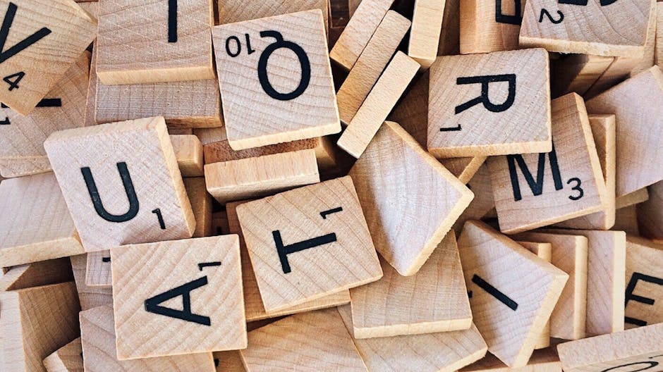
alphabet, board game, bundle

What Is Typography?

Typography is simply defined as the art and technique of arranging type to make written language legible, readable, and appealing when displayed. As simple as it may sound, it is not just merely choosing what font to use or how make everything a little more readable. There are a few things to consider in dealing with typography.
Typography is typically done by typesetters or compositors, but actually there are a bunch of other terms for people who do typography depending on the type of arrangement they render. This article is focused on web designs.  Before we dig deeper, let us discuss the important terms frequently used in web design.

ELEMENTS OF TYPOGRAPHY IN WEB DESIGNS

  • Typeface

    It is basically a font family. It is a set of fonts with different designs and features. So, this would be something like Arial, Times New Roman, Calibri, Century Gothic, Trebuchet, Comic Sans, etc.

  • Font

    It is a set of characters with the same style and size. One example is 11-point Arial in bold or 14-point Times New Roman in italic.

    It is typically measured in points (pt). Points dictate the height of the lettering. There are approximately 72 (72.272) points in one inch or 2.54 cm. An example would be the font size 72 would be about one inch tall, and 36 would be about a half of an inch. This would be the size, particularly the height element of typography.

  • Weight

    In typography, weight is defined as any particular styles used to make the characters appear heavier lighter. This affects the size element of typography.

    For example, if you want the text to be extra thin, you have the option to use the weight ‘thin 100’or if you want your text to appear bolder than usual, you may opt to apply the weight ‘extra bold 800’. It depends on how thick or thin you want your text to appear.

  • Kerning

    It is simply defined as the process of adjusting the spacing between characters of in a proportional font. This does not only improve legibility or readability, this is also to make it look more appealing and pleasing to look at. However, you do need a separate editing software to use this function.

  • Tracking

    It is basically letter-spacing. It refers to an optically consistent degree of increase (or sometimes decrease) of space between letters to affect visual density in a line or block of text. This is not to be confused with kerning because the former is used to adjust the density issues in reading.

  • Leading

    If tracking is all about letter-spacing, leading is the line-spacing aspect. It is the distance between two baselines of lines of type. Leading is so named because conventional print shops put strips of lead between lines of type to increase vertical space.

These are only the key elements of typography. There are a lot of things under each of these elements that you need to consider but basically, all you are after is to make your web design more legible, readable, aesthetically pleasing and of course interesting for people to give it a go.

12 Web Design Terms Everyone Should Know

Photo of a Woman Thinking

Being in the world of web design can sometimes feel like learning a new language. You will read terms like CMS, hosting, compression, CSS. Do the terms ring a bell to you? Maybe yes, maybe no.

There are a lot of technical terms referring to the different aspects of web design and it can get confusing at times. For some who are just getting started with being a web designer or just someone looking to have their website designed, it can be really overwhelming at first.

Here’s a list of important terms that one non-web designers should know:

  • CMS


    • It means Content Management System. It is a platform that enables designers to develop and modify the content of a website without requiring one to have any technical knowledge about web codes
  • Domain

    • is simply the name of the website and it usually ends in .com, .net, .org. Domains nowadays can end with .me, .design, .io.
  • CSS

    • Cascading Style Sheet
    • Used to format the look of a website that determine how different the elements within the web page will appear on the screen by the user. It allows the different elements like color of the text, size, background, position of the different parts of the page to be set.
  • Compression

    • Optimization of file or data sizes in a format or reasonable size that takes up less space and that will eventually help to speed things up.
  • CTA

    • Call to Action
    • These are links or buttons prompting you to “Click here”, “Sign Up” that will vary depending on the website you are into is an example of a CTA. It entices or expects users to take a particular or predetermined action.
  • Hex Code

    • It is a six-digit code that starts with a #. Each hex code has its assigned color that will appear on the designer’s web page.
  • Typography

    • Refers to the arrangement and usage of different typefaces. With typography, websites are able communicate well with their visitors.
  • Hosting

    • Provides services by which data will be stored on a publicly-accessible server. Once it is uploaded, people are able to view the content of a website.
  • SEO

    • Search Engine Optimization
    • This enhances the likelihood of your website to appear or be discovered in various search engines such as Google, Yahoo, Bing, etc. Typical SEO techniques includes the use of keywords that can be helpful on the content portion and the use of metadata.
  • Visual Hierarchy

    • Web designers come up with a visual hierarchy before putting content on a website. This is important when figuring out what’s more important and what needs emphasis.
    • Helps to make sure your message gets across the right way.
  • Resolution

    • Refers to the image detail. So, when your images have a higher resolution, the higher quality it has. When a high resolution image is used in a website, it looks clear, crisp, and colorful. The image will have more details. When the opposite happens, a low resolution image will appear blurry and pixelated.

  • Responsive Web Design

    • When you say a website has a responsive web design, this means a website will fit in all screen sizes or different devices. This helps users experience optimal and seamless browsing on your website.

A Short Guide on Choosing the Right Font

font, reading, typeface

which font is the right one?

When choosing a font, you might think picking the prettiest looking is the best choice. Nope, that is not always the case. Typography is a huge territory. Before I dive into details, let us first define the word font. What is a font? A font is the style (bold, italic), size, typeface (Calibri, Garamond, Arial, etc.) of the words you type. When we think of font, we usually mean the typeface. Choosing a font is like choosing your outfit. You pick a dress depending on the occasion. Same is true with fonts. You do not use fancy fonts on your resume. You use those on birthday invitations. This guide will help you on the different types of fonts, the things to consider in choosing a font, and the places to get FREE fonts for commercial use.

Basically, there are four classifications of fonts: Serif, Sans Serif, Script, and Decorative. The Serifs are the ones with edges. The most popular example of this is Times New Roman. Sans Serifs are the opposite of Serif. They have no extra lines on the edges. Trebuchet, Century Gothic, and Comic Sans are just a few examples of it. (This article uses Sans Serif!) Scripts are the cursive style or the handwriting style. Refer to typefaces like French Script, Monotype Corsiva, and Bradley Hand. Lastly, the decorative ones are the beautifying  fonts. They are usually used for special purpose like the typefaces Jokermann, and Curlz MT.

Now you know the various classifications, let us discuss the importance of choosing the right fonts. Fonts set the tone and mood of your text. Imagine the full text of the Bill of Rights printed in script style and in size 12. No one would ever want to read that. No one would take it seriously. Viewers will just close the page and find another website that offers the same content. If your websites’ tone is formal, you better not choose anything cursive. Stick to Serifs. If your website is about a hobby like drawing or reading, you can choose playful styles or the handwriting styles.

You also have to consider the readability of the font. Consider if your preference makes it easy for viewers to read your content. Look at the size, color, spacing. Legibility, on the other hand, is the ability for the viewers to distinguish the different letters and numbers. In some fonts, number 1 can be mistaken as lowercase l. These things can confuse readers so make sure your font is both readable and legible.

It is important to know the purpose your material. If you are making a business card, you need a font that is readable despite the small size. If you are sending an online invitation, make sure the font is readable on screen. Take into consideration your audience, too. Older people tend to prefer bigger fonts. If you think your target audience are adults 40 and up, then, you might want to consider thicker fonts. You can always experiment which fonts work, but at the end of the day, make sure it represents your brand.

For the FREE fonts, the first website to check is Font Squirrel. You do not have to refine your search on what is available for commercial use because they are all 100% free commercial fonts. Next on the list is DaFont. This website offers selected commercial fonts. Make sure to check the free option when searching. They have a wide selection of fonts and they are not the common ones you see. If you are looking for a font for your Christmas card, look no further. The third option is Google Fonts. Who would have thought Google would give tons of free fonts? Yes, they are all open source so you are welcome to modify and use them commercially. The downside is you will not get anything unique. If you are looking for decorative fonts, check the previous two.

There you have it! After you have applied the guide, test your fonts by conducting a survey on your website. You can also have some beta testers browse your website and ask for their feedback.


© 2017. All rights reserved. Phoenix Website Design • Sitemap • (602) 388-8622
20 E Thomas Rd #2200, Phoenix, AZ 85012
Phoenix Web Design

Serving: 

Apache Junction, Avondale, Buckeye, Carefree, Chandler, Chandler Heights, El Mirage, Fountain Hills, Gilbert, Glendale, Goodyear, Litchfield Park, Mesa, New River, Paradise Valley, Peoria, Phoenix, Queen Creek, Scottsdale, Sun City, Sun City Grand, Sun City West, Surprise, Tempe, Tolleson, Wickenburg