Posts

Reasons Why Social Media Can Help Your Businesses

Android Social Media AppsSocial media are internet  services that allows user to interact with each other and generate content using online communities. It has the capacity to open marketing opportunities for small to large businesses.

Think about this, you can spend a few hours in social media to increase your sales with no extra cost. Here are some of the reasons why social media has been a useful platform for businesses:


  • Using social media is easy. You do not have to be a computer genius to participate in them. All you need is a basic know how, and you are off to market your product or services. If you need help on marketing your product, you can read this social media guide.
  • Social media is the fastest platform to reach millions of users all over the globe in a personal basis. You can definitely increase your business visibility thereby increasing the recognition of your brand. Just write a social media profile for your business and then interact with consumers. Get people to like and share your page. Posts that are shared only means your brand will be introduced to new individuals who can be your potential clients.

    If you do not use social media, you will be limited to your usual clients. You will then have a hard time reaching people outside of your immediate circle. Using the social media platform will increase your inbound traffic.

    You should join as many platforms as possible to let individuals reach your business. If an older demographic tries a particular keyword on Facebook then you can easily be reached. On the other hand, if a millennial tries to search your business in a different social media, it can still be found. Syndicating your content in different platforms is good. It will enable the different demographics to access your business.

  • Your search ranking will improve if you have in the social media for more than a year. If you are able to move on top, your traffic will surely give positive results for your business.
  • When your brand is interactive, meaning you share content, post statuses, comment on social media, it becomes personalize. Users would do business with you, not your company.
  • Social media is a communication venue and consumers appreciate when you answer their comments on your page rather than getting the automated message which is very impersonal. This shows that you are seriously being attentive to your audience. And that will assure you not only of sale but loyalty to your brand as well. The millennial in particular are known to be the brand loyal of all demographics.
  • Posting well-written content is the best way of telling the users that you are an expert and a leader in your field. To do this, use social media platforms and make your presence felt. Connect to your audience and your followers will look up to you.

There is no reason for any business not to use the social media as a platform of communication. Get started now and see the growth of your business.

Must Haves for Mobile Commerce Sites

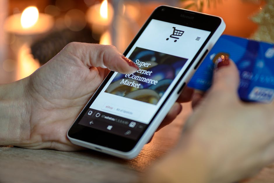
Person Shopping using Mobile Phone

Shopping online at mobile websites

Smart phones and mobile devices are changing our lives. These devices are becoming a substitute for the big and bulky desktop computers. Mobile users are slowly moving away from the conventional ways of online shopping. They prefer to use their mobile phones to buy things they need, schedule appointments, and pretty much everything.

The whole website should be scannable.

Give your website visitors an overview of your entire website. Allow them to freely browse different sections of your online shop. Provide a category list of the products that you are currently selling. Most users do not scroll down while browsing on mobile. They just mostly scan. They do not read things on screen the way they read other printed materials. People browse on their mobile because they already know what to buy. Mobile purchases should be quick and easy.

Homepage should not be too crowded.

Your homepage should provide easy access to everything, but do not put too much photos. Most importantly, there should be a search box. You should highlight the search box so that first time visitors can easily find the products they wish to purchase. If they cannot find a search box, they will abandon the page. It is no more complicated than that! Other than that, you can advertise the latest deals and promotions like a discount coupon, a free shipping deal, or something that can entice them to buy more items.

Pagination links should be clickable with your thumb.

Add pagination links to each page of your mobile website. Searching a website without pagination links is like finding a needle in a haystack. These links are helpful when you are browsing for a certain product in a huge pile. These pagination links are necessary for your customers so that they can browse your website conveniently. Your website will also load faster because the pagination links divided the items into pages, and when you have a speedy website, customers are happy. You would be helping your customers if you provide large clickable areas. Give these links some space and do not put the page numbers too close to each other.

Notify customers on restock.

When people are shopping online, it cannot be avoided that some items get out of stock. Most websites do not have an email function for these unavailable items. (Personally, it is such a hassle that I would have to constantly check a website if they have restocked the items that I want.) If you cannot notify via email, at least, tell the customers if the current inventory is low.

Customers can shop as guest.

Mobile e-commerce sites are helpful when customers are doing their last minute shopping. These people just want to buy something and the registration form is a huge barrier to be honest. Do not force them to register or to login. Instead, highlight benefits of registering – like free shipping, detailed package tracking, and exclusive perks – so that they will be more compelled to register. If they had a satisfying shopping experience, they themselves will decide to register and buy more items at your website.

Marketing a Product Using Social Media

facebook and other apps

How to use social media to your advantage?

Nowadays, people are always on the internet and they have the need to constantly update the world about their life. They search for everything on the internet. Your website is not the be-all and end-all of things. It is not enough when you plan to sell products online. Social media plays a huge role in e-commerce. Follow these tips on how to market a product:


  • Strong social media presence.
    Popular brands have different social media accounts. They go where the customers are. Whether it is on Facebook, Twitter, Instagram, your social media team should build your brand’s online profile. They need to fill the basic information like bio, official logo, website links, and so on. These information may seem mundane, but these are extremely important. The team should also prepare the visuals to upload to these accounts. You can utilize free online photo editors – e.g., Pizap, Pixlr, Canva – to edit your product photos and add attention-grabbing descriptions.

    Since Facebook is the top social media platform, experiment with its features. You can offer exclusive promotions on your wall or you can utilize the Facebook Ads to advertise your latest products. It is not enough to invest in one platform. Twitter and Instagram also have a huge following. (If you need help on that, you can use this Twitter guide I recently posted.) You can use social media not only to promote, but to reach out to the public. You can link the social media users to your official website.

    It is also a great way answer to your customers questions since most people just freely ask via social media. Great customer service will always win customers. Plus, social media has a larger scale than traditional media. This will give you an edge over competitors since your audience now is the whole world.

  • Boost your online presence.
    Yes, social media is huge part, but online visibility could also mean email. Do not solely rely on social media. Always encourage people to sign up for email. You can offer them exclusive perks via email campaigns. It will definitely help you and the great thing about it is: IT IS YOURS. You can create it the way to want and how you want it. When you are in social media, the space you occupy are owned by its respective owners. When you use email, it is totally yours and you do not need to pay ads. Just redirect your email subscribers to the latest deals and they can easily shop at your website.


  • Learn from the experts.
    It is not enough to get your content out there. You also need to follow influential people and learn from what they send out to their followers. Be a follower yourself and you would be in the shoes of your followers. Watch what they do and actively monitor for new opportunities. Find ways to engage with these experts. They usually have Twitter accounts so go there and be active.


  • Conduct giveaways.
    Encourage people to follow you by doing giveaways. It can be a simple like and share contest on Facebook, or a retweet and follow on Twitter. Once one person will share these giveaways, it can extend to thousands of people. Your followers will spread the word for you. The more shares you will get, the more people will know more about your brand. You can giveaway one of your products or perhaps a gift certificate.


Building a buzz is a collective effort. It is a combination of blogging, and social media (Facebook, Twitter Instagram, etc.) Remember that social media constantly changes. It is best that all these online campaigns should always redirect to your website. Your website should not be on the sideline. It should be the main hub. Draw people together across various social media platforms to one central website.

More Effective Strategies to Gain Conversions

Sales and Conversions

Tips on gaining more customers.


Online shoppers are very choosy and fickle. They cannot decide what to buy at times and you have to guide them on what they could purchase. These tips will help you on gaining their attention and making them click that add to cart button.

    • Keep it clean.
      White space is a good thing. Do not cause a mess on the homepage. You must learn how to keep the homepage minimal. Like what I mentioned on the previous post, the goal is to show less products so that the customers can have more focus on what to buy. Avoid having too many moving images on the homepage. Remove all the unnecessary details and unrelated products. Always go for a simple, yet professional design. It will definitely help you in gaining your customers’ trust.
    • Only show what is needed.
      Do not show irrelevant details that will not interest the customers. You only need to show the main features of the product. Indicating the technical specifications the beside product is not required. Utilize call-to-action buttons like “Read more…” links throughout the website. CTA buttons are really helpful in organizing the website and know that they are not only limited to the “buy now”, or the “shop now” buttons.
    • Guide your customers.
      Your website should have a certain structure so that they can easily scan the page. It should not be a crowd of different unrelated products and scattered descriptions. There should be a flow on where they need to focus their attention. You can use arrows to point a important video presentation or point out purchase link. Keep the flow going and always suggest where to go next. Avoid a dead end on any web page. Make sure a page leads to somewhere with more beneficial information.
    • Follow the Gutenberg Rule.
      The Gutenberg Rule describes the reading activity of most people. Reading starts from left to right and top to bottom. People usually look at top left first and end at the bottom right. This is why in most websites, the buttons that will redirect to another page usually are placed on the bottom right and the highlighted products usually are in the top portion of the page.
    • Prepare your customers for their next purchase.
      If you have managed to made a sale and the customers are satisfied with their purchase, use this time as an opportunity to present enticing offers to your customers. You can give out discount coupons for their next purchase, suggest special offers that might spark their interest, or even offer a free shipping on the next order. Once they bought a product, they will more likely to purchase more. Use the “Thank you” page to advertise other products.


Whatever tips and strategies you might decide to apply, please remember to never comprise the quality of your service. Great customer service is the best tool to gain conversions. Word of mouth is the best form of marketing. Do not underestimate the power of online reviews and testimonials because it will surely help you gain more customers.

Strategies to Gain More Conversions

Charts, Graphs, Conversions

How to gain more customers?

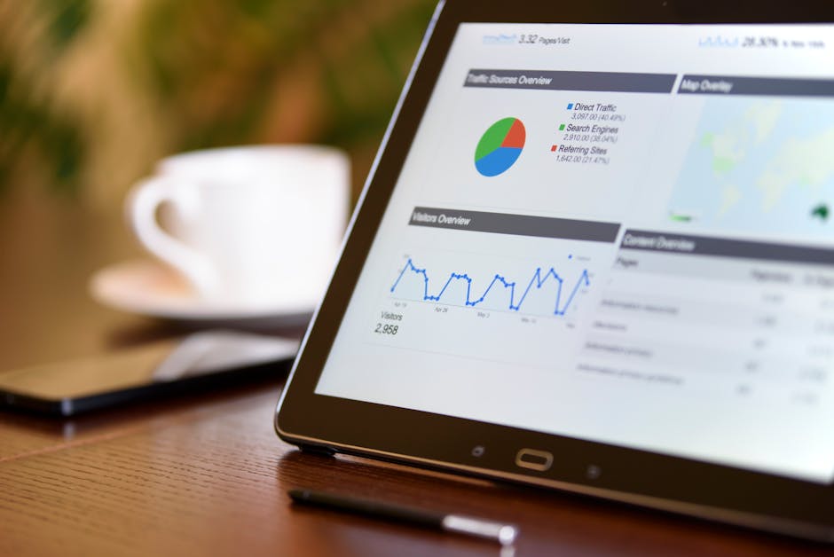
Numerous businesses have adapted the concept of e-commerce over the years. It is evident in the rise of various online stores that are manufactured to sell. However, a good-looking website helps, but it is not everything. You can use these tips to help your business gain more customers and eventually, increase sales.

    • Prevent Choice Paralysis.
      What is Choice Paralysis to begin with? It happens when there is just TOO many choices presented. It is great to present customers unlimited options, but too much might confuse them. To avoid Choice Paralysis, you must give suggestions to what to buy, provide buying guides, highlight bestsellers. For example, let us take a look at bookdepository.com. On its homepage, it gave a suggestion to browse new releases. If you do not want to buy those, the bestselling books are indicated just below it. They also compiled a list like: best books ever, best children’s books, best cookbooks, and so on. All the books are not on the homepage. It is important to present less products so that the customers can have more focus.


    • Provide a Preview of the Product.
      Like in most physical stores, customers want to see what they are buying. Same is true with online stores. You must show the product. How? Provide pictures and not only that, customers should have the option to zoom in for better viewing. If you are selling books, provide the final book cover, dimensions of the book, and other details that will help the customer. If you are selling shirts, pictures of the shirts in several colors should be available. Sizing charts also come in handy so that the customers can easily compare the different sizes. People buy based on what the a certain product looks like. Of course, they would not buy an overripe tomato, or a dented can of sardines.


    • Allow Customers to Try the Product.
      When you go to a grocery store, they would give out a free taste of the different products they have. Even online, it’s also important to let the customers try the product. Software companies nowadays provide a free version of their programs. You do not have to necessarily buy these products to be able to use them. If you like it very much, you can choose to upgrade. This is a great strategy because when customers like your product and it is great, they will depend on it. When they depend on it, they will most likely avail of the premium version of the product. Do not let your customers imagine on what the product will be like. Instead, let them try the product and sooner or later, you will win customers.


    • Generate a Desire for the Product.
      It is essential to grab the attention of the potential buyers. Once you have it, gain their interest by how these products are beneficial to them, how these products are different from the rest. If they are already interested, create desire for your products. They will act on that desire because they know by now how beneficial the products are. If they are still having second thoughts, you can develop a sense of urgency like a limited time offer of 15%, or an offer of free shipping on the all orders placed within 24 hours.


(MORE) Website Blunders to Avoid

accident, mistakes, be careful

Careful on making these mistakes!

There is nothing more frustrating than finding your way through a convoluted website. Satisfy your customers. Show them that you care for their needs by not driving them away.  Clearly, you would want a smooth transaction online and withdraw from anything annoying. Here are MORE blunders to avoid that may help you in achieving that functional website:

  • Tiny Pagination

Pagination is a type of navigation that provides users access to multiple pages of a certain website. When you search terms on Google, numbers 1 to 10 appear at the bottom of page. A next button is also visible for you to click and to navigate your search results. Same is true on websites that have a lengthy list. In some forum sites, the pagination provided are microscopic and insignificant. Help your users by not wasting their time. These list of pages numbers are necessary!

For example, the products on an online shop are divided into several pages. Pagination helps on making your website load faster because not a lot of items are displayed all at once. Thus, your users are satisfied because they can conveniently browse your website.

  • Complicated Sign Up Forms

Certainly, you have visited Facebook during the 24 hours. I am sure you noticed that if you need to create a profile, you just need to fill in a few text boxes. You only need a name, an email, a password, birthday, and gender. Viola! You can now access the whole of Facebook.

Time to ditch long and boring forms! You are providing a hindrance for people to access your website. Keep the forms short and brief. In some online shops, you can even buy items without registering. There is no need to ask for heaps of information because you might end up saying goodbye to potential clients.

  • Too Many Animations

Do not bombard your main page with moving images. Viewers of your website will not know where to look first. Focus on specific products that you want to display first. Utilize the use of pagination. It is exceptionally hard to direct customers to a particular product and also, numerous shifting images can be truly irritating.

  • Bizarre Font Styles

Reading a lengthy text with unconventional typefaces can be frustrating. (Oh, hello eye strain!) Typography is the central part of designing. Do not make reading a painful task to do. Make your website easy to read and to navigate. If possible, use San Serif typefaces.

  • Not Mobile Responsive

People are always on the go. They probably will not leave their mobile phones behind.  It would be a huge loss if you ignore the effect of mobile users. Choose a website design that is responsive in all platforms, whether your website will be browsed on a desktop computer, a tablet, or a mobile phone.


Perfection is hard to attain, but these tips will definitely improve the performance and the conversion rate of your website. When designing your website, always put yourself in the shoes of your viewers. Because if they had good experience on your website, they will patronize it and they will tell their friends about it. You will gain rewards in multitude of ways.

Website Blunders to Avoid

website, failure, mistakes

Avoid these mistakes!

Practical and functional websites make profit. They win the hearts of the customers.  How can you make profit if your website looks awful? Your website should have a clear structure and uncomplicated navigation. The last thing you want to do is to chase away potential customers. Check out this list of mistakes that you should definitely avoid.

  • Broken Links
    In the world of online shopping, broken (or dead) links should be avoided. You will use a potential customer if your website links do not redirect to the desired product. People are always searching for things to buy and the links you provide are important in helping them to get the products they want. You can check for broken links using this free link checker. Avoid the “page not found” error at all cost!
  • Small Font Sizes
    How can you invite people to buy your products when they cannot even read product descriptions clearly? Customers like to search and browse for new items so verify that these texts are readable and the search results are understandable. The longer they are, the harder they are to read.As I have mentioned above, links are important to get to a specific product. Make sure these links are clear and legible. Customers should be able to distinguish the link and the description where it leads to. Same is true with buttons like Shop Now, Add to Cart, etc. Make sure these buttons, links, and search results are large enough for customers to read.
  • Unclear “Contact Us” page
    I can personally relate to this. I am really particular in shopping for books. It should be in this edition, under this publisher, and so on. Rather than rummaging through over a million books, I usually contact the website and have them search for me instead. Some websites do not even have a clear phone number and email address for inquiries. I get the generic website email that probably will not get opened in a few days. I do not mind waiting, but it is not always the case. Usually, customers are impatient. They will find another website that will cater to their needs. Provide contact details that will guarantee a response. Most importantly, do not generate an automated response. It seems very impersonal and it will drive people away.
  • No (or inactive) social media accounts
    This is related to the mistake above. Everyone now has a social media account. Advertise your official accounts together with your contact details. People tend to search for your business and inquire online. Answering questions quickly means good customer service. You give a positive impression that you want to help out customers and you care about them. You create that inviting atmosphere that will surely get loyal customers. Engage with people on Facebook, Twitter, Instagram, and those people will spread good things about your website in return. You can repost or retweet the positive feedback you got and certainly, it will encourage other people to shop at your website.
  • No search boxes
    Most of the time, customers know what they want. Give them an easy access to that product. Whether you have five or a million products, always provide a way to search and to refine the existing search results. Prevent Choice Paralysis. It is always good to provide your customers many options, but when there’s just too much, customers get confused.

Need more? There is another list here!

Four Things You Should Know Before Building a Website

computer, internet, website

What makes a good website?

Websites are not only about codes, images, and latest designs. You are building a place for visitors to know more about the products and services you offer. Everything you put into your website should be essential towards a certain goal. Like in any project that you do, it requires extensive planning. You would not want to waste money on something you would never use.

  1. What is the purpose?

Define your goals. What do YOU want? Do you wish to sell online? Perhaps you want to inform people? Or maybe you just want to share your hobby and entertain your readers? Write everything down. Put your thoughts on paper first. You do not have to make a website right away.

  1. What to put?

Every single element you will include in your website should coincide with your identified goals. It is important to know what information will your website’s visitors find relevant. Of course, you would want to show the world your work! Think also of what your audience needs. Do not exhaust them by letting them read long and boring paragraphs. Give them value. So, if you own a business, do not just put the photos of your products. Provide information on how and where to avail these products. Add other significant information like email and contact number. They can just call you if they have questions or if they wish to make reservations. If you have a physical store, provide a detailed map. Content should always be informative!

  1. What photos to use?

Aside from great content, using the right images also help. Gather photos by utilizing free stock photos or you can even use your own photographs. You want those images to make a mark and you would want it to have a lasting impression. You can always buy photos, but purchase only photos when needed. There are already tons of free photos out there. This list of websites may help you.

  1. What design to use?

You are very happy to have created a visually appealing design, but when you previewed it, it causes eye strain. You have allocated days to create that perfect design, but then, I am sure it will be outdated in months. Learn the fundamentals of design and typography. Remember, you do not have to need to fill every corner of your website. Design is more than the visual aspect.

Consistency is key. Do not use all the colors of the rainbow. When in doubt, use white space. Highlight the important details. Make text larger so it will be easy to read. Choose a set of fonts and stick to it. Lastly, the design should be flexible. It should be viewed properly in all browsers, and in all devices. Plan what works for you and what does not. This will help you narrow down your choices rather than changing deigns from time to time.

Making a website should NOT be expensive. This is still the initial phase. You should be well geared before starting that website you have been dreaming of. Having the content, images, design you need will help you get there faster. Chances of everything crashing down are higher if you are not prepared. If you are ready to take that leap and move on to the next level, this guide will surely help you!

Five Ways to Make your Website more Functional

computer, searching, buying

online shopping

Websites have been a great tool for sales and marketing. Now, people prefer to shop online than go to an actual retail store. They search for directions and contact numbers online before they actually decide to drive for miles just for one product that they have been anticipating for a long time. If you are business owner, this list will give you an idea on how to make your website beneficial and useful to your target audience.


  1. Have clear Call-to-Action buttons.
    What are these CTA buttons? These are the “Shop Now”, “Buy Now” buttons customers can click to access your available products online or they can be “Contact Us Now!” sign wherein you added your business’ phone number or email address. Give those important details and make sure they are within reach. Do not make customers click several pages just to get answers.
    Having an FAQ page also helps. You can list all the frequently asked questions in one area and give it a concise answer. Adding fluff and flowery words will not help. These are your action items. You want these items to help your customers and hopefully, they will end up buying something from your store.


  1. Do Not Require to Sign Up.
    Websites these days have an option to “Shop as Guest”. Registering before you can buy online is not necessary. If you require customers to sign up, you just made a stumbling block for potential sales. Impulsive buyers will change their minds if the buying process is tedious. Let your customers shop with ease and with less textboxes to fill.


  1. Provide Guides.
    You have now a “Buy Now” and customers can shop as guest. The next tip is to educate your customers. Provide tutorials on how to shop smoothly. Help them on how to achieve the product’s fullest potential. For example, if you are selling beauty products, you can include make up tutorials perhaps. You can also provide style guides if you are selling dresses. Give out visual guides on outfits for various seasons. Whatever your business might be, set a page for customers to learn.


  1. Simplify your Site Design.
    I have always said this in my previous posts, too. You do not have to choose a colorful design. Embrace the white space so customers can see your products clearly. Allow them to click on images for better viewing experience. Keep the design simple. However, you can make your CTA buttons vibrant. You make these buttons stand out. Make customers want to click that “Shop Now” button. Do not focus on the design; focus on the buttons.


  1. Make sure your links work and make sure customers know that these are links.
    Check all your buttons. It would be a shame if someone decides to buy and then, your “Shop Now” button did not work. Verify that these important links get redirected to the correct path. You would not want to see an HTTP 404 or the page not found notification.
    If the customers are searching for a particular item, make sure that these links are visible and that they know it is a link. These links will help them get to a product that they want. If you want to find out if your website has 404 errors, check this out. (I hope I made that link identifiable or else, I failed at following my tip. In case you missed it, this website will help you catch 404s!)
© 2017. All rights reserved. Phoenix Website Design • Sitemap • (602) 388-8622
20 E Thomas Rd #2200, Phoenix, AZ 85012
Phoenix Web Design

Serving: 

Apache Junction, Avondale, Buckeye, Carefree, Chandler, Chandler Heights, El Mirage, Fountain Hills, Gilbert, Glendale, Goodyear, Litchfield Park, Mesa, New River, Paradise Valley, Peoria, Phoenix, Queen Creek, Scottsdale, Sun City, Sun City Grand, Sun City West, Surprise, Tempe, Tolleson, Wickenburg